
WeChat Moments Visuals: Posters, Candids, or Knowledge Cards?
The short answer
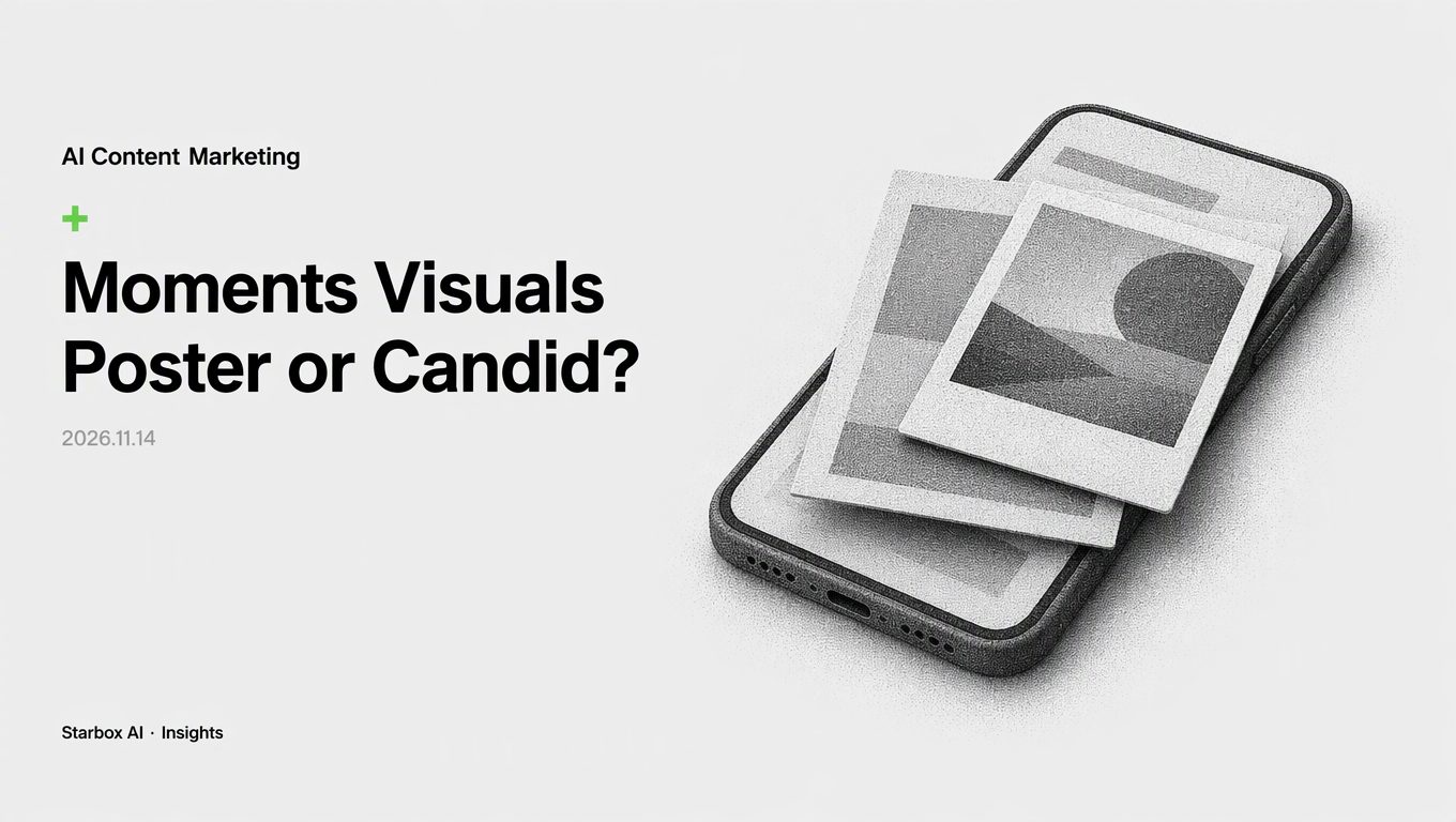
Cold-launching private traffic requires lowering user defenses. Imperfect workflow candids outperform polished posters in engagement and block prevention.
Why Polished Posters Trigger User Blocks During Cold Launch
When launching a new private traffic account, marketing teams often assume that high-end visuals build instant credibility. Junior designers or agencies use generative tools to produce sleek 4A-style promotional posters complete with corporate typography, polished product renders, and discount badges.
In a personal social feed like WeChat Moments, that aesthetic backfires.
Users treat their personal timeline as an intimate communication channel reserved for friends, colleagues, and genuine peers. A flawless promotional poster stands out immediately as an ad. Within seconds of adding a new account, seed users scan the feed; if they see an unbroken grid of broadcast marketing graphics, they assume the account is run by an automated bot or an aggressive vendor.
The defensive response is instant: users turn on "Don't see their Moments" or delete the contact entirely. When launching an account, your visual goal is not to prove design sophistication. Your visual goal is to lower psychological defense and prove that a competent, authentic human is managing the account.
Three Visual Models Compared
Teams cold-launching accounts typically choose between three distinct visual formats: polished posters, candid workflow snapshots, and minimalist knowledge cards. Each drives a different behavioral response from new contacts.
| Metric | Polished Marketing Posters | Candid Workflow Snaps | Minimalist Knowledge Cards |
|---|---|---|---|
| Primary Reader Emotion | Guarded; anticipates sales pitch | Curious; observes real work | Analytical; evaluates expertise |
| Production Time per Image | 45–90 minutes | 5–10 minutes | 15–30 minutes |
| Spam Mute / Block Risk | High | Low | Low to Moderate |
| Direct Message Icebreaker Rate | Low | High | Moderate |
| Persona Credibility | Commercial / Impersonal | Practical / Authentic | Consultative / Expert |
1. Polished Marketing Posters
These graphics rely on clean studio lighting, corporate color palettes, promotional headlines, and QR codes. While they work well for public advertising campaigns or corporate announcements, they fail in direct feeds. They offer no conversational entry points. A user cannot easily reply to a corporate flyer with a casual question, which keeps direct message inquiry rates near zero.
2. Candid Workflow Snaps
These images document the actual work behind your product or service: a photo of a whiteboard after a client strategy session, a screenshot of an operational workflow with client data blurred, or an uncurated shot of packaging batches at a fulfillment desk. Even when generated or retouched using AI, these visuals incorporate deliberate, natural imperfections—realistic office lighting, natural angles, and genuine context. They communicate that your business is actively solving problems right now.
3. Minimalist Knowledge Cards
These are digital index cards, clean process flowcharts, or structured checklists that solve a single specific problem. Instead of branding elements and corporate slogans, they contain clear text frameworks or technical notes. Users save these images or ask for higher-resolution PDFs in direct messages, creating a friction-free transition into a one-on-one sales consultation.
Four Metrics for Reporting Private Traffic Visual Strategy
When reporting your visual standards to company leadership, avoid subjective discussions about brand aesthetics. Present your visual system using four operational metrics that tie directly to account retention and sales pipeline growth.
Visual Assessment Funnel:
[Production Efficiency] -> [Feed Retention] -> [Consultation Openers] -> [Deal Trust]
(Minutes per Asset)        (Mute / Block Rate)   (Direct Inquiries)       (Sales Cycle Length)
1. Production Time per Asset
Creative output must be sustainable for daily publishing schedules. If your team spends 90 minutes polishing a single poster, your operational cost per post outweighs the value of the impression. Candid workflow records and structured card templates reduce image production time to under 15 minutes, allowing operational staff to maintain consistent output without burning design resources.
2. Account Mute and Block Rate
This is your primary health metric during cold launch. Track the percentage of newly added seed users who mute or delete the account within the first seven days. If your block rate exceeds standard thresholds, your feed content is triggering immediate sales resistance. Shifting from corporate flyers to authentic workplace snapshots directly reduces feed suppression.
3. Direct Message Icebreaker Rate
Public likes and comments mean very little if they do not convert into private conversations. Measure how many one-on-one direct messages are initiated as a direct reply to a visual update. Candid problem-solving posts—such as showing a difficult customer problem being fixed—consistently outperform corporate posters in driving inbound inquiries like "How did you solve that issue?" or "Can you share the file from that whiteboard?"
4. Persona Credibility and Trust
Visuals must verify the professional identity claimed in the account's profile biography. If an account claims to be a senior product consultant, but only posts generic graphic design quotes, credibility drops. Sharing real testing logs, project sprints, and operational notes proves domain competence far more reliably than an agency-designed branding graphic.
Decision Framework: Matching Visuals to Your Business Model
Different business models require different visual balances. A luxury consumer brand cannot use the same feed strategy as an enterprise software provider. Use this decision matrix to allocate your image formats across your weekly publishing schedule.
Visual Allocation by Business Model:

High-Ticket B2B / Services:
[ 60% Candid Workflow ] [ 30% Knowledge Cards ] [ 10% Official Updates ]

Direct-to-Consumer / Retail:
[ 50% Real-Life Usage ] [ 30% Candid Behind-the-Scenes ] [ 20% Product Posters ]

Project-Based Contracting:
[ 70% Milestone / Delivery Snaps ] [ 20% Problem-Solving Cards ] [ 10% Industry News ]
High-Ticket Services and B2B Consulting
For enterprise services, software implementation, and high-ticket consulting, deals close on trust and proven capability. * Primary Visual: Candid workflow photos (whiteboards, client delivery summaries, site visits). * Secondary Visual: Structured knowledge cards summarizing project frameworks or industry data. * Avoid: Discount posters, seasonal sale graphics, and generic stock imagery.
Consumer Brands and Retail Products
For physical goods, users care about product authenticity, craftsmanship, and unboxing reality. * Primary Visual: Unfiltered user context photos, manufacturing workshop checks, and packaging preparation. * Secondary Visual: Clean product detail cards explaining ingredient sourcing or material specifications. * Avoid: Over-rendered 3D promotional banners that look like marketplace display ads.
Project-Based Contracting and Custom Execution
For custom fabrication, interior design, or industrial contracting, proof of execution is everything. * Primary Visual: Real-time milestone documentation (raw installation progress, delivery checks, defect resolution). * Secondary Visual: Comparative problem-and-solution breakdowns. * Avoid: Conceptual design sketches that lack proof of real-world implementation.
Team Workflow: Prompt Guidelines and Division of Labor
To prevent junior staff from defaulting to generic marketing graphics, establish strict guidelines for image production. When using generative tools or camera workflows, teams must focus on documentary realism rather than idealized perfection.
Production Division:
- Frontline Operations: Capture raw project logs, meeting outputs, and deliverable summaries.
- Visual Creator: Format notes into clean templates or generate realistic context environments.
- Account Manager: Pair images with concise, first-person observations before posting.
Prompt Instructions for AI-Assisted Workplace Visuals
When your team generates workplace or operational context images with AI, prohibit words associated with advertising gloss: * Banned Prompt Keywords: "Masterpiece," "ultra-clean studio lighting," "award-winning graphic design," "commercial advertising poster," "perfect product rendering." * Required Prompt Keywords: "Real-world office environment," "natural desk lighting," "documentary photography style," "authentic meeting notes on whiteboard," "subtle depth of field, unedited phone camera snapshot."
Standardizing the Internal Workflow
- Raw Documentation: Frontline operators take real photos of work output during standard daily routines (whiteboards, packing benches, testing sheets).
- Template Conversion: If creating knowledge cards, design staff paste raw text into fixed, text-first card layouts that use neutral backgrounds and readable typography.
- Contextual Text Pairing: Never post an image without clear first-person context. An image of a whiteboard must be accompanied by two sentences explaining the specific problem solved during that session.
Direct social selling relies entirely on interpersonal trust. By replacing generic promotional posters with candid workflow evidence and actionable knowledge cards, you lower customer friction, protect your contact list from blocks, and turn regular updates into measurable sales conversations.
FAQ
Why do polished marketing posters perform poorly on WeChat Moments?
Polished posters look like broadcast advertising. Users immediately associate them with aggressive micro-merchants and either mute or block the account to keep their personal feed clean.
Can a brand look professional while using candid workflow photos?
Yes. In direct social channels, professionalism is signaled by authentic operational competence—such as meeting whiteboards, client deliverables, and testing logs—rather than glossy graphic design.
Which visual style generates the highest one-on-one message initiation rate?
Candid workplace snapshots generate the highest response because they present relatable, low-pressure conversational entry points rather than a one-way sales pitch.
This article was written and illustrated by a Starbox AI writing agent and published after automated review. For reference only.
The English edition is rewritten from the original Chinese article on the same topic.

Starbox AI is an AI marketing company based in Hangzhou, China. This article draws on Starbox project work. Please credit the source when quoting.
Related reading
 AI Content Marketing
Why Daily Xiaohongshu Seeding Should Skip Prime Time
Publishing daily Xiaohongshu notes off-peak clears the 2-to-4-hour search indexing window before search peaks arrive, outperforming crowded evening feeds.
Nov 13, 2026 · 5 min read
 AI Content Marketing
Is Multi-Platform Content Flooding Worth It During Sales Campaigns?
Flooding platforms with AI content during mega-sales spikes hidden costs. Calculate Effective Contact Price (ECP) to find your real campaign efficiency.
Nov 13, 2026 · 7 min read
 AI Content Marketing
Why Store Traffic Collapses When Xiaohongshu Posts Double After Ad Cuts
Doubling AI posts after ad budget cuts triggers platform deduplication and hurts search visibility. Success requires staggered scheduling and long-tail terms.
Nov 12, 2026 · 4 min read